COCA-COLA, Italy
# Share a Coca
Multi-national marketing campaign of Coca-Cola.
Overview
Who was the client?
The choice to test the "#Share a Coca" campaign in Milan, Italy, in 2012 was a strategic decision by Coca-Cola. Italy was selected as a test market due to its status as one of the largest consumers of Coca-Cola and the number one producer of Coca-Cola in Europe. However, Coca-Cola Italy had faced some challenges during the 2010-2011 period, with a 2% decrease in sales.
What was my role?
As a UX-UI Designer, my responsibilities included user research, wireframing, prototyping, UI design, usability testing, cross-functional collaboration, staying updated with industry trends, and collaborating with developers to ensure design implementation.
Problem
The problem at hand was a decline in sales for Coca-Cola Italy. This decline was most prominent within two age groups: 18-25 years old, which experienced a 5% decrease, and 35-40 years old, which had a 7% decrease. The issue was particularly pronounced among female consumers, accounting for 60% of the sales decrease.
Solution
The solution involved a tailored communication strategy, leveraging a mobile app to engage the younger demographic and utilizing emails and phone calls for the older age group. This approach facilitated the conduction of comprehensive interviews with 15 representative users. To efficiently gather data from these groups, a dedicated mobile application was developed to gain deeper insights into their interests and preferences.
Tools
Adobe Creative Suite (Illustrator, Photoshop), Sketch, InVision.
Google Analytics, Balsamiq, Axure.
A/B Testing, Responsive Web Design (RWD), User Flows, UX Research, Visual Design.Slack, Trello, HTML, CSS
Team
1 UX designer
1 Content Designer
6 developers
1 project manager
My Role
UI/UX Design
User Research
Wireframing
Prototyping
Information Architecture
Collaboration and Communication
Timeline
Overall: 19+ weeks
Discovery & Research: 10+ weeks
Design & testing: 9 weeks
Design Process
My design process, working with step-by-step procedures, involved a structured approach focusing on user-centered design principles.

Interviews
During the ideation phase of the project, I conducted user interviews to build new personas and to inform the design. Together with the team, we prepared an interview script with 32 open-ended questions, focusing on our target audiences’ values, motivations, and daily routines. In 4 days, I recruited and interviewed 7 users remotely. We referenced the user interview findings throughout the entire design process.
The objectives that influenced my questions during the user interviews were primarily aimed at:
Understanding user values, motivations, and needs.
Gaining insights into user behaviors and daily routines.
Identifying pain points and challenges users face.
Surveys
You used open-ended surveys to gather qualitative data from users, and 50 users participated in these surveys. From their responses, you concluded that there was a strong demand for additional features and improved functionality. Throughout the project, you applied these findings to inform the design process, with a focus on enhancing user satisfaction by addressing the specific needs and preferences expressed by the survey participants.
Information Architecture, Wireframing
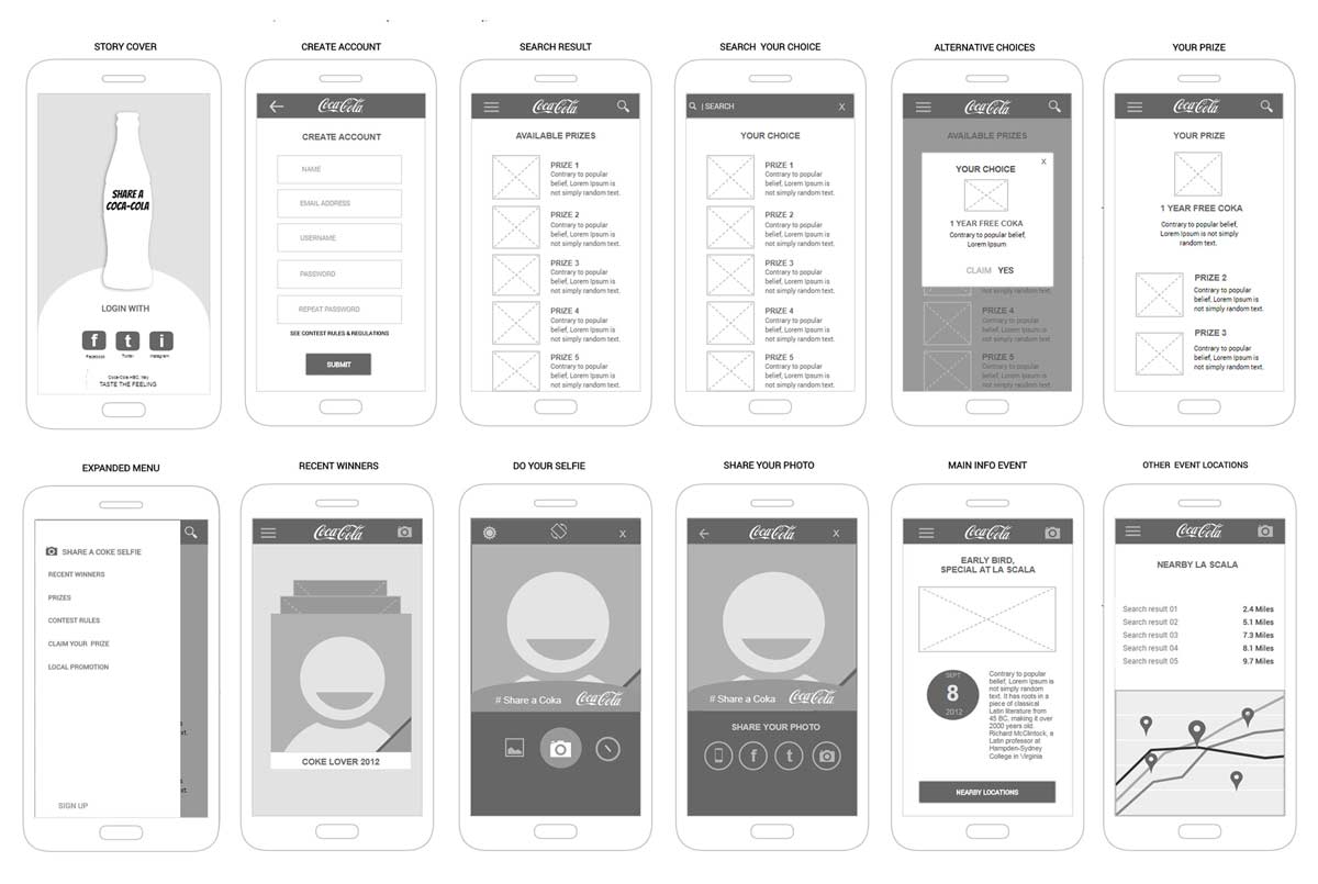
I created low-fidelity wireframes initially using InVision, which allowed me to translate my initial sketches into digital form. Afterward, I added some stock images and marketing copy to make them more representative of the final product. These low-fidelity wireframes were tested with users, resulting in valuable feedback that led to a few alterations.

UI Design
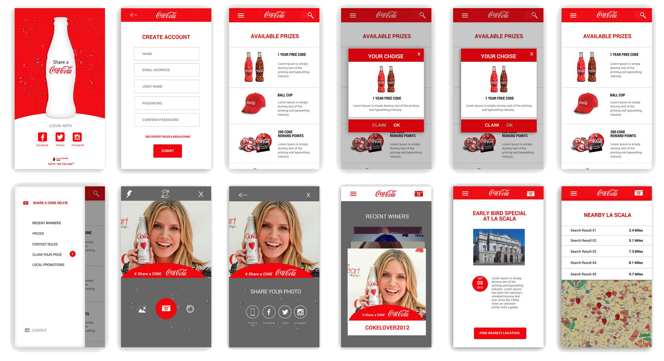
Fresh and modern UI design tailored to Coca-Cola's brand values for web and mobile platforms, enhancing user satisfaction.

Next steps
How would you continue this project? Was there something that you would’ve loved to do but didn’t have the time or resources? What advice would you give to the team or the designer following you?
01
Continuing this project, I would focus on refining and optimizing the existing design. I'd consider further user testing to gather feedback on the high-fidelity prototype and make necessary adjustments. Additionally, I'd work closely with the development team to ensure a seamless transition from design to development, maintaining effective communication throughout the process.
02
If time and resources were not limitations, I would explore more advanced features and interactions that could further enhance the user experience. I'd also consider conducting in-depth user research and testing to gain deeper insights into user behavior and needs, allowing for more tailored design solutions.
03
For the team or designer following me, I would advise maintaining a strong user-centric focus. Keep communication channels open with the users, stakeholders, and development team. Regularly test and iterate on designs based on user feedback. Embrace creative thinking and innovation while staying aligned with the project's objectives and user needs. Remember, great design is an ongoing process of improvement.
