
FEDERAL AVIATION ADMINISTRATION
October 2020 – December 2022
CARL
The Consolidated Agency Resource Library
Overview
Who was the client?
Federal Aviation Administration (FAA) authoritative information from all relevant FAA Lines of Business and Staff Offices (LOB/SO).
What was my role?
As a UX-UI Designer, my responsibilities included user research, wireframing, prototyping, UI design, usability testing, cross-functional collaboration, staying updated with industry trends, and collaborating with developers to ensure design implementation.
Problem
- Information fragmentation: The FAA likely had information scattered across various departments and systems, making it difficult to access and manage.
- Inefficient workflows: The process of finding and accessing information within the FAA might have been time-consuming and inefficient.
- Data consistency: Ensuring data accuracy and consistency across different systems can be a challenge.
- Security concerns: Protecting sensitive FAA information from unauthorized access is a critical concern.
Solution
- Provide search capabilities to facilitate the retrieval of pertinent information for solution users.
- Can browse various content sources to inspect and access available content.
- Display Dashboards by Line Of Business so that users can easily find LOB-related content.
- Dashboards in the Solution to be developed and maintained by the Lines of Business themselves.
Tools
Design and prototyping: Figma, Adobe XD, Sketch, InVision.
User research: Optimal Workshop, UsabilityHub, Hotjar.
Additional: Google Analytics, Miro/Mural, Typeface, Color Hunt.
Team
1 UX designer
1 Content Designer
3 Developers
1 Business Analyst
1 Project Manager
1 Client
My Role
UI/UX Design
Wireframing
Prototyping
Information Architecture
Collaboration and Communication
Timeline
Overall: 48+ weeks
Discovery & Research: 3+ weeks
Design & testing: 45 weeks
Strategy and Research
Who are the users of the system?
Visitors to this site can generally be grouped into three types: Product Owners, Entity users, and Content Creators.
Why user goes to CARL?
Users go to this Application to do Analysis, Search, Workspace / Create Dashboard, Create Reports.
What is CARL App used for?
The domains support two distinct types of Services: To build, and maintain Dashboards by Line Of Business, and to produce Statistics Reports.
Scenario
Basic Search, and Advanced Search
As the Product Owner I want the UI to provide search capabilities to facilitate the retrieval of pertinent information for solution users.
Analysis
I use analysis to do deep dives that complement the work I do in my workspace Ex: business development, compliance oversight, administration work.
Workspace/ Build Dashboards
As the Product Owner, I want there to be usage statistics for the solution and it's various elements to that we know what functions people are using and what they are not using to help enable solution improvements.
Help
As a user, I would like to have access to help tools, and job aids to increase my productivity and fluency with the solution.
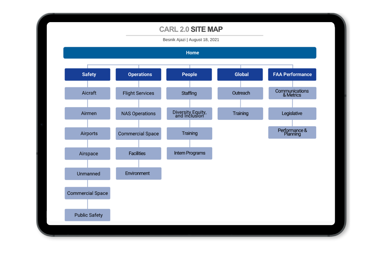
CARL Site Map
Navigation, and Content Filtering
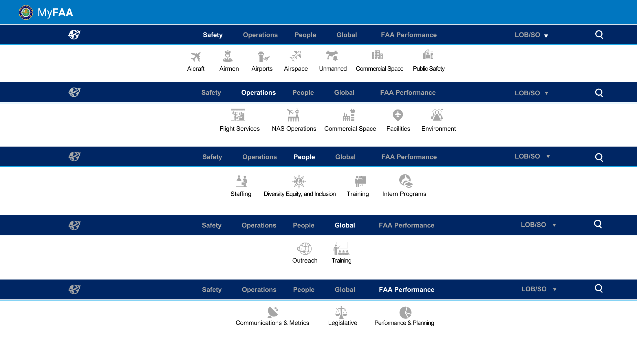
Navigation in CARL uses two entry points: Top Navigation and Sections.
Main Sections
The CARL app has five main sections: Safety, Operations, People, Global, FAA Performance

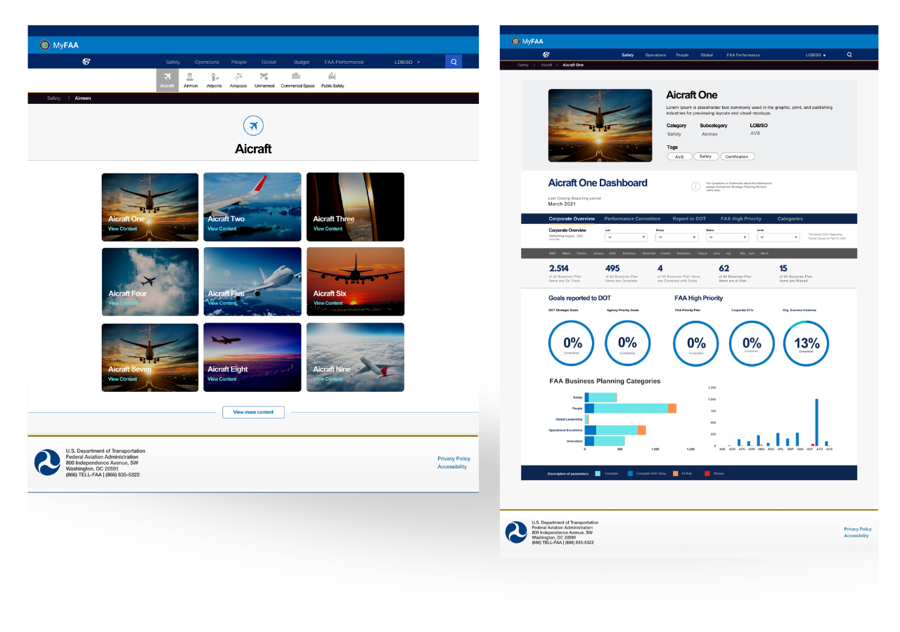
Subcategories Landing Pages + Detail Page
My Dashboards
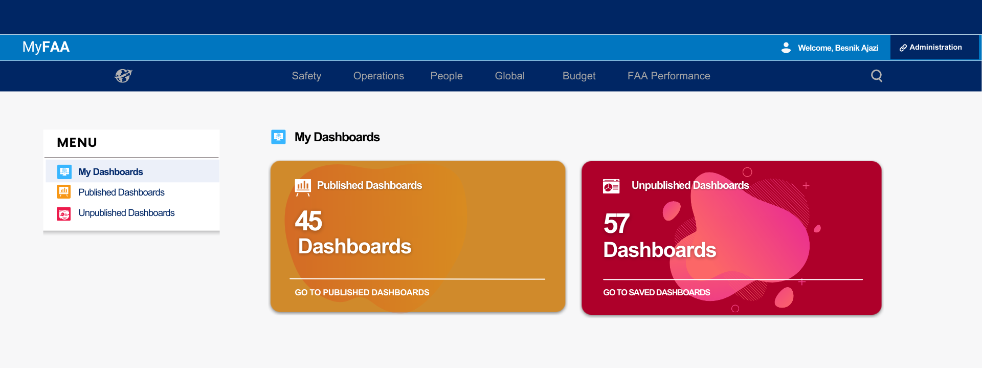
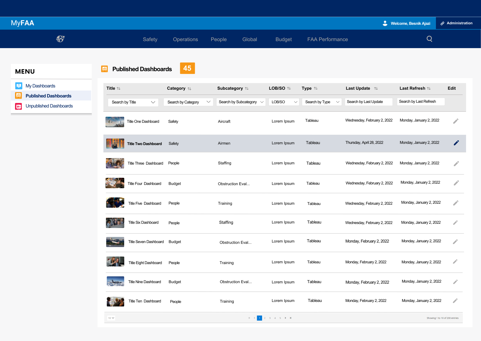
Published Dashboards Section
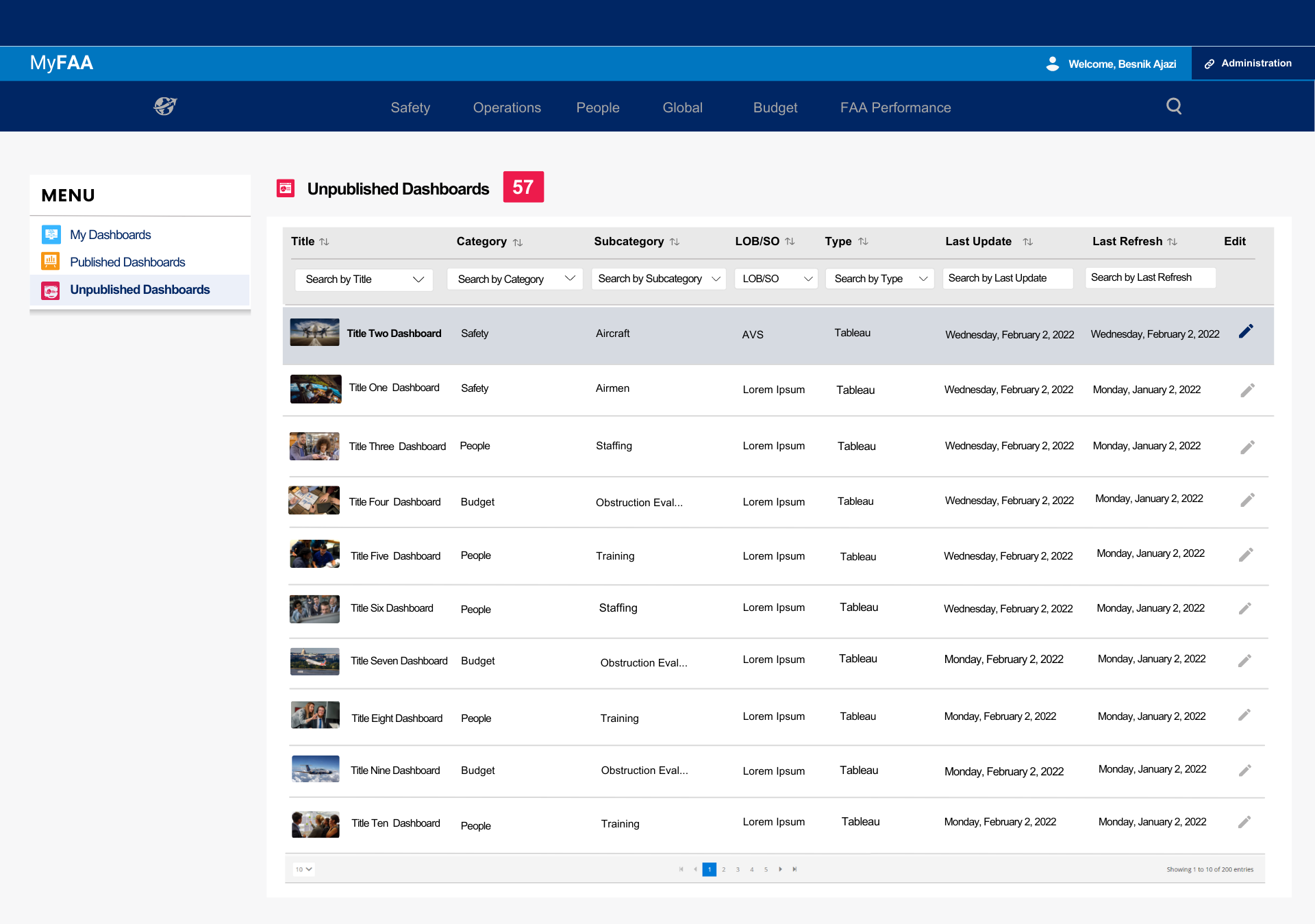
Unpublished Dashboards Section
Next steps
How would you continue this project? Was there something that you would’ve loved to do but didn’t have the time or resources? What advice would you give to the team or the designer following you?
01
Continuing this project, I would focus on refining and optimizing the existing design. I'd consider further user testing to gather feedback on the high-fidelity prototype and make necessary adjustments. Additionally, I'd work closely with the development team to ensure a seamless transition from design to development, maintaining effective communication throughout the process.
02
If time and resources were not limitations, I would explore more advanced features and interactions that could further enhance the user experience. I'd also consider conducting in-depth user research and testing to gain deeper insights into user behavior and needs, allowing for more tailored design solutions.
03
For the team or designer following me, I would advise maintaining a strong user-centric focus. Keep communication channels open with the users, stakeholders, and development team. Regularly test and iterate on designs based on user feedback. Embrace creative thinking and innovation while staying aligned with the project's objectives and user needs. Remember, great design is an ongoing process of improvement.
